OVERVIEW
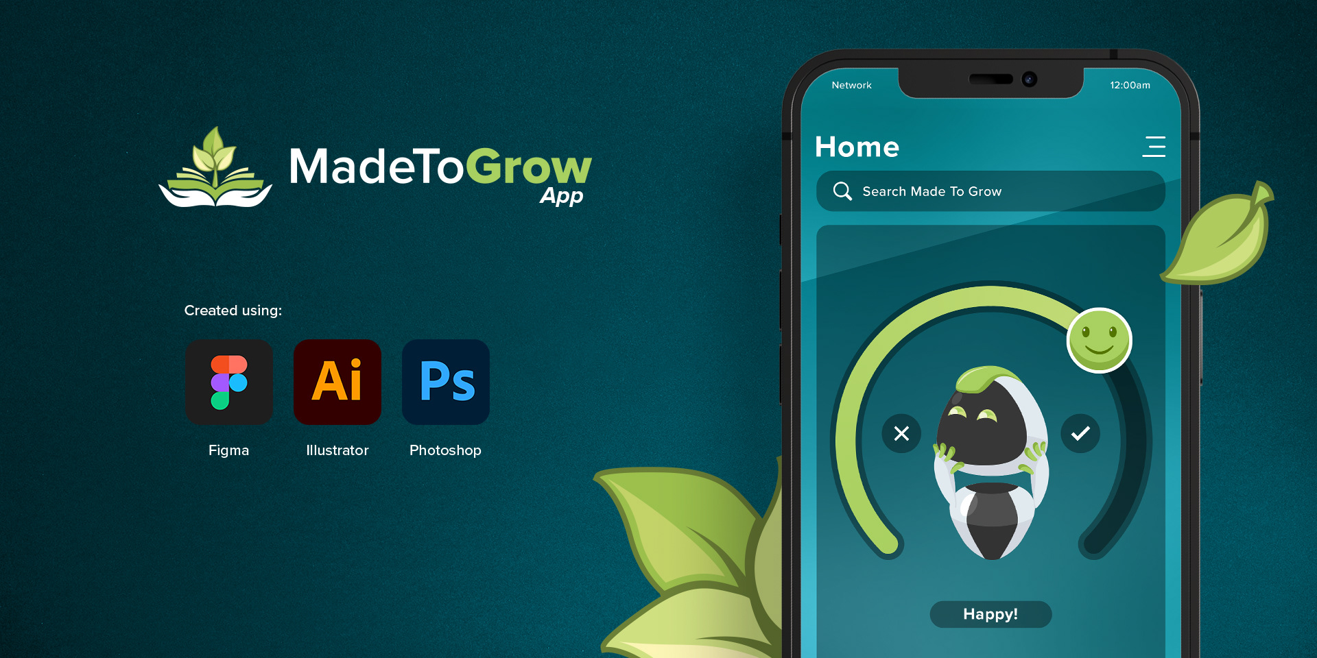
MadeToGrow is a mobile application designed to provide education courses for users who want to learn how to grow and improve their daily productivity and have a more positive attitude towards life.
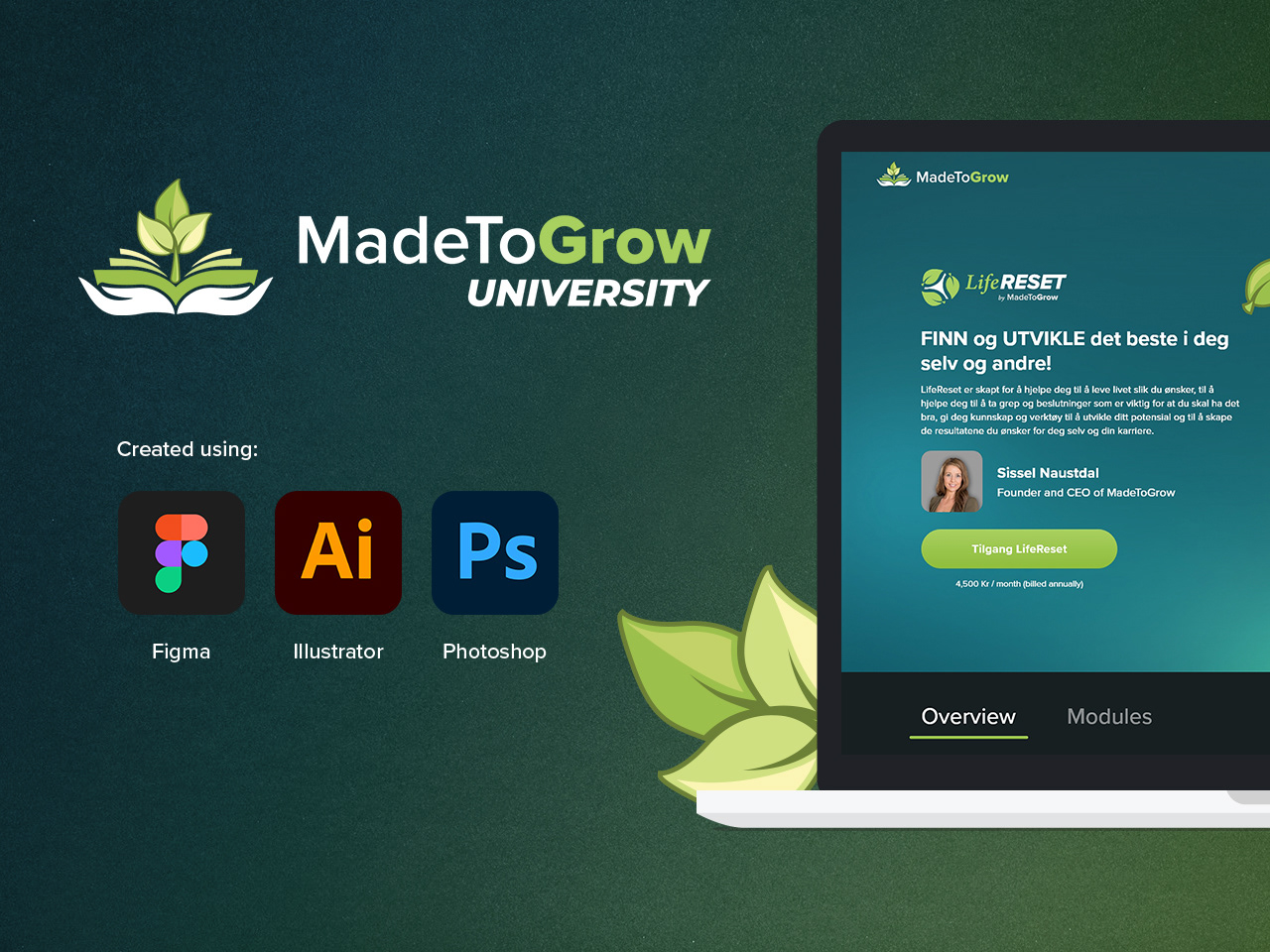
This is the second version of the app and it was created as part of a corporate and holistic effort by the MadeToGrow team, with the objective being to transform the way education and learning is perceived from a dull task to an interactive, fun and enriching experience.
This is the second version of the app and it was created as part of a corporate and holistic effort by the MadeToGrow team, with the objective being to transform the way education and learning is perceived from a dull task to an interactive, fun and enriching experience.
The content has been developed in Norway and is based on extensive international research and Norway's own research in the areas of motivation, mastery, mindset, brain malleability, learning, self-esteem, relationships and health.
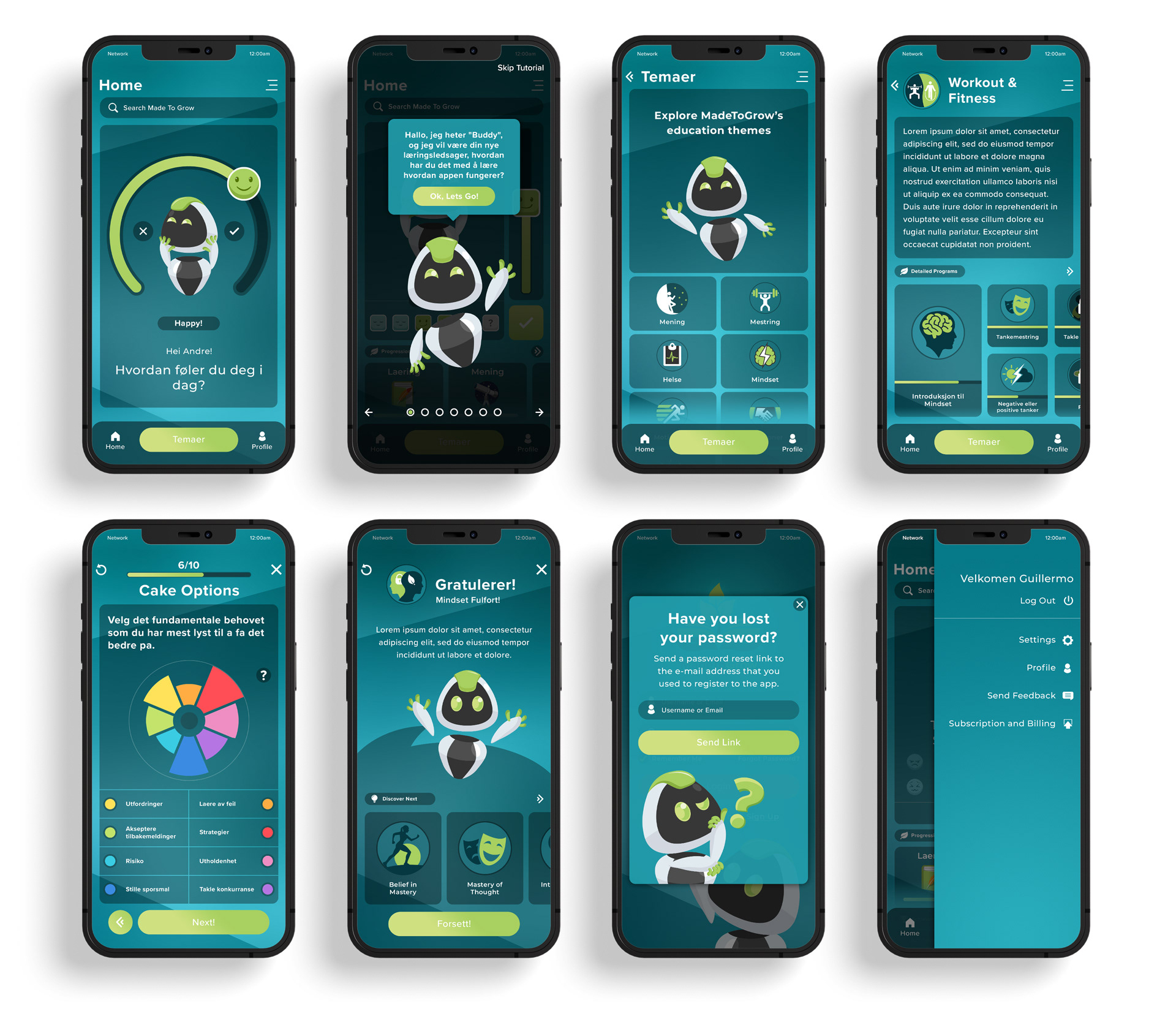
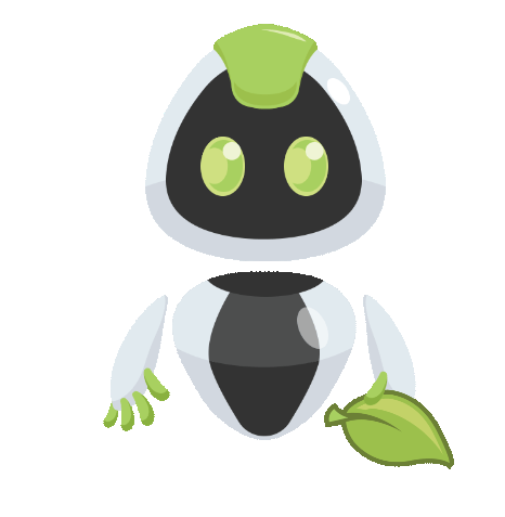
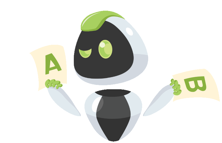
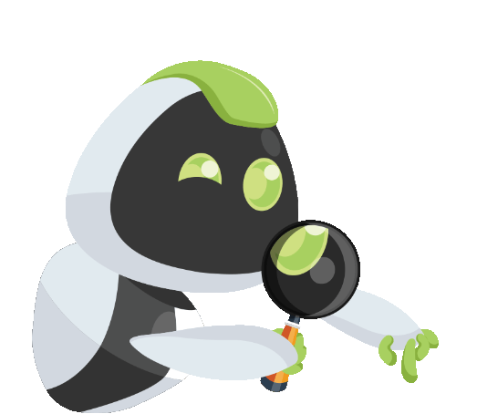
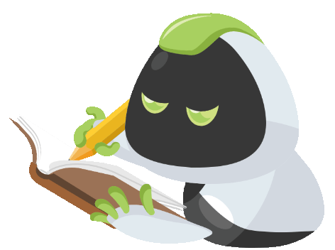
An important requirement for the app was to create a "Buddy" or "Assistant" mascot as an integral part of the guidance process, this generated a new branch to the research that demanded to design and create a neutral character with no age, cultural, religious, race or gender inclination that can also be as expressive and supportive as a human character would, this in turn would set the app apart from any potential competitors that may be published in the future.
My Role
Product Designer
Entire product design from research to conception, visualization and testing. Including but not limited to: Product Strategy, User Research, Interaction, Visual design, Prototyping & Testing, Animation Design, Marketing Material Design
Project Date: Jan 2020 - Mar 2020
Problem Statement
MadeToGrow app's challenge is creating a platform with recurrent and active engagement with young students & professionals in ages ranging from 15 to 50 years of age. Research and statistics suggest that this particular group of individuals is under constant pressure from a very competitive professional market, causing problems related to anxiety, low self-esteem, sleep deprivation, eating disorders, learning deficiencies, stress and others.
We decided to address these afflictions and create an engaging learning and motivational experience so that MadeToGrow's app helps these users overcome their difficulties and grow into a better version of themselves.
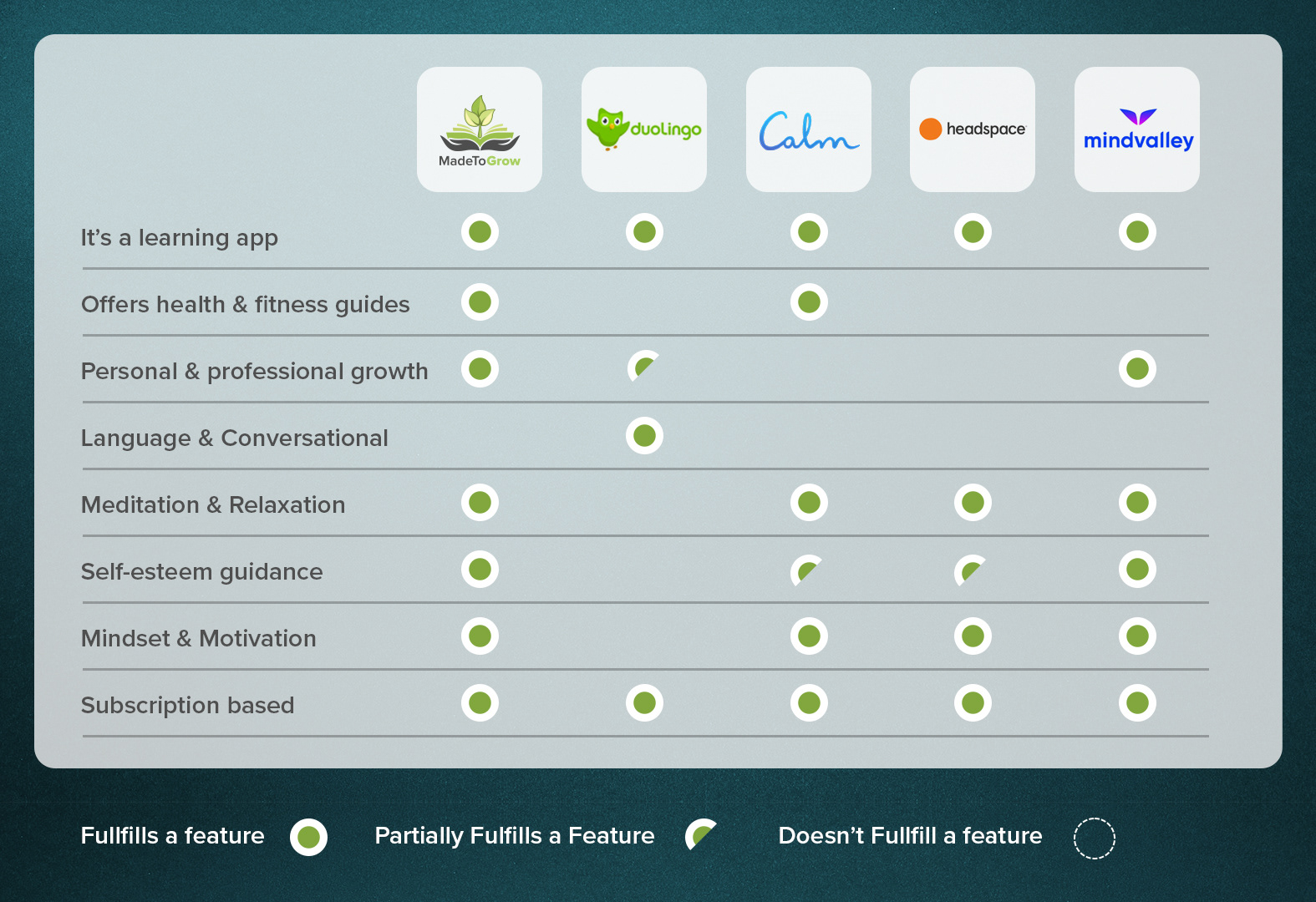
Competitive Analysis
At the time of starting the project, there were no directly comparable products in the market, so I focused my research on products and services related to the field of e-learning with a focus on relaxation & meditation and a main target group ranging from young adult students to senior professionals.
After deciding which products had similar content and features to the ones we wanted to show in the app I shortlisted the more prominent items and proceeded to create a competitive audit report to create comparisons that would highlight the features that would be used as inspiration and the ones that should be discarded as they differed from the working concept for our product.
These comparisons coupled with SWOT analysis helped highlight general advantages and disadvantages of online courses and how e-learning could be made into an interactive and engaging experience.
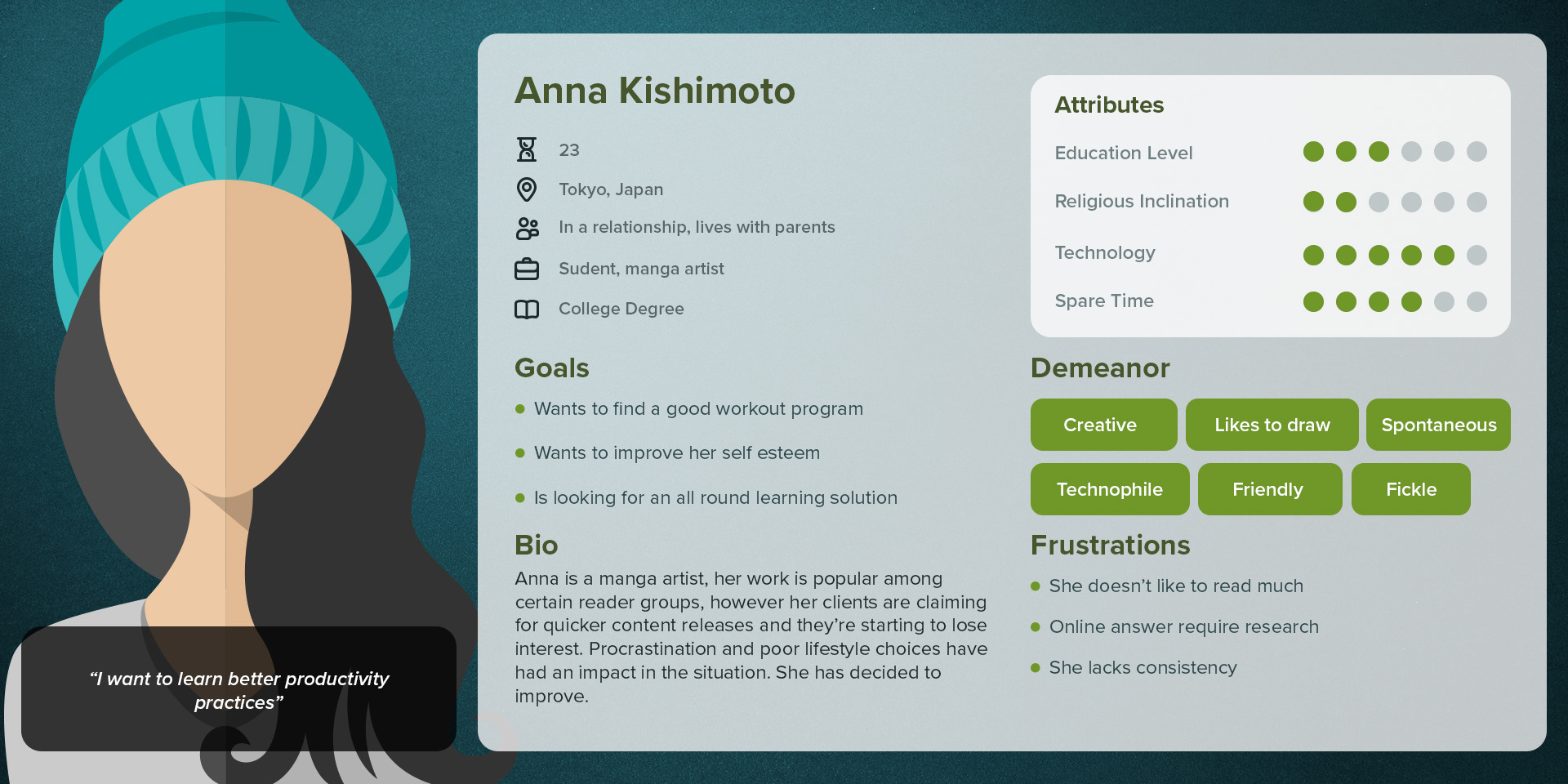
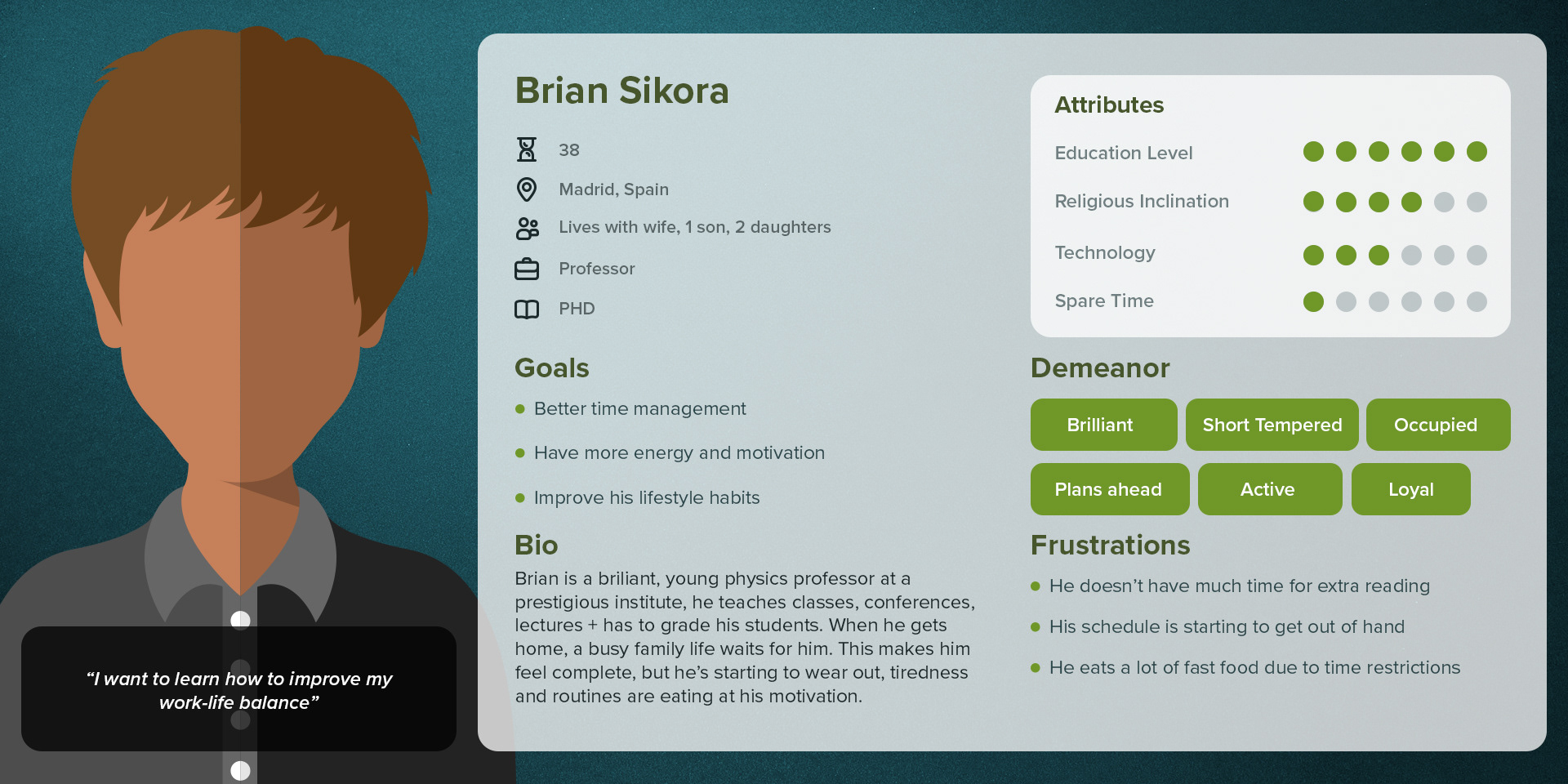
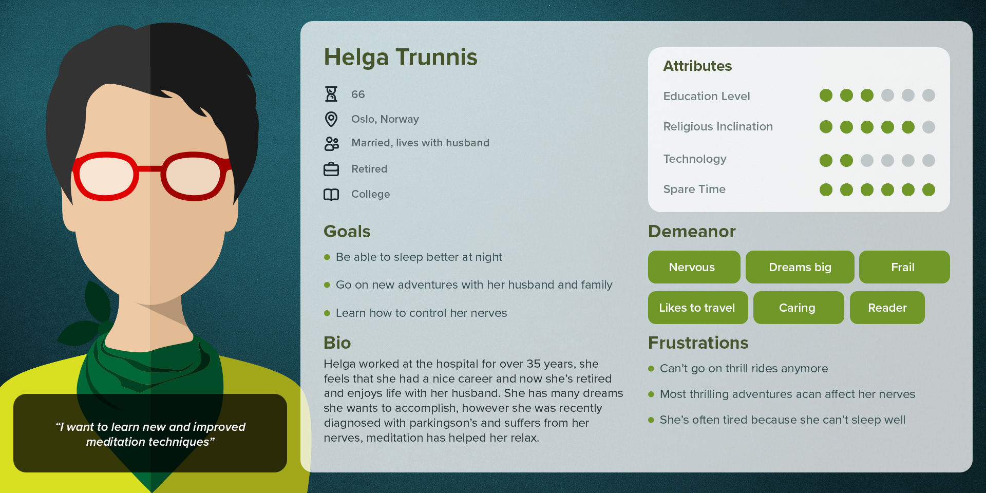
Personas & Empathy Study
After conducting interviews and surveys I gathered the data and reviewed the quantitative and qualitative results and defined three profiles of personas that would represent three key target groups: Anna (Student, 23), Brian (Teacher, 38) and Helga (Retired nurse, 66).
These personas helped visualize and empathize with the thoughts and intentions of the main user groups the app targets as well as prioritize goals according to their needs and make educated design decisions that would improve the overall user experience of the app.
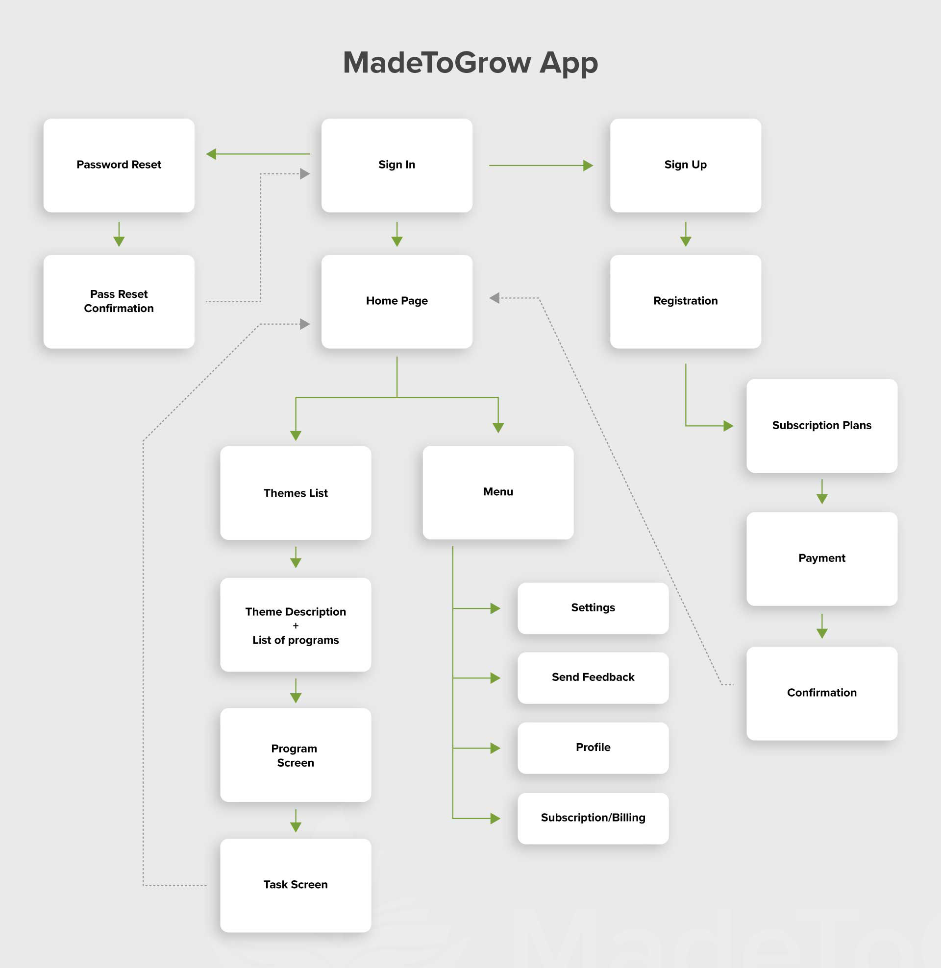
Information Architecture
Based on the previously conducted research, I started to write down the names of the screens that I knew that were needed on post-it notes, then I proceeded to organize all the information in order to have a usable structure from where I could draw and polish variations of possible user journeys that our personas would take on our app. Starting from sign up all the way to the lessons & tasks and back to the home screen I repeated the process taking different decisions each time in order to get different results and clearing possible roadblocks in the user journey.
The result was a simplified and effective distribution of the complete education system (Themes to Tasks) and other necessary screens.
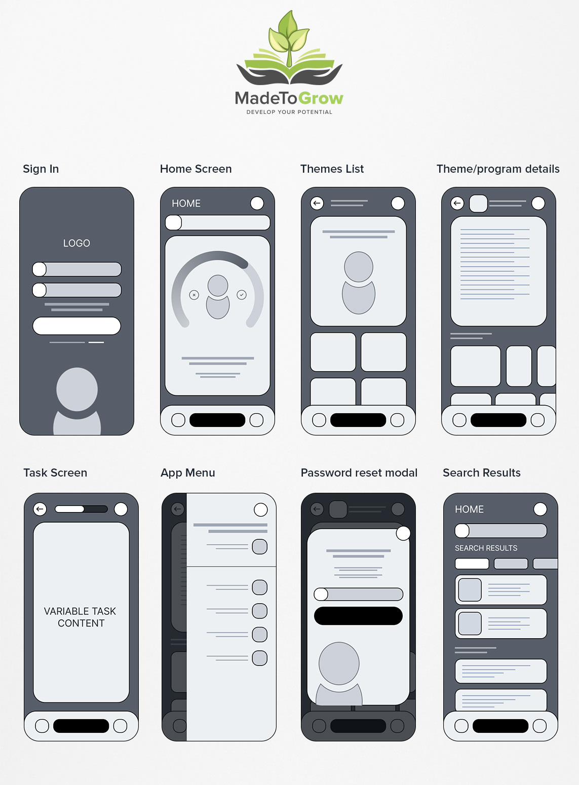
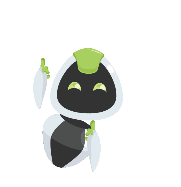
Wireframes
After having a clear idea of the most efficient navigation path I started to create sketches organizing and including all the elements of the app, including the mascot as it would take considerable space in the user interface.
Multiple iterations of wireframes of each screen were necessary to explore different visual hierarchies that affected the way users perceived and read the information in the interface. In the end we created a poll and gathered the data of which versions did users of different demographics found easier to comprehend from testing a low fidelity prototype.
These are some of the wireframes that would later be used to produce the final visual design.
Visual Design
The visual design was developed following previously established brand guidelines plus visual iterations of mood boards to create an usable UI kit and produce a final set of first version screens of the app.
These versions were then used to conduce a poll that in return would indicate which visual designs users liked the most.
Prototype
Prototypes were created at two key stages of the process:
- A low fidelity prototype using the wireframes to test usability and fix user experience roadblocks
- A high fidelity prototype with the final UI that would later be developed into a final working product.


Conclusion
I enjoyed working on this project because I believe that it fills a key gap in the market and it has great potential for users who are keen on growing and improving their mindset.
If I had the chance to repeat the UI/UX design process I would change the following:
- Perform a heuristic evaluation to create alternatives for users with disabilities to be able to use the app
- Include a day mode/night mode switch to have a light color alternative for the app, especially long reading pages
- Create an alternative version with no mascot for users who find it distracting
When the screen designs were finished I was tasked with creating animations for the mascot as well as producing posters, flyers and videos for marketing the product and also to include inside the lessons.
After this UX process, I learned so much more about growth and mindset and MadeToGrow's app potential, as well as taking home invaluable amounts of experience in the field of UX/UI Design.